Infinity Review
2. December 2017
uZombies Review
5. December 2017Longing for a fresh approach to the worn-out puzzle genre? Well, I might have something for you...
The definition of “indie” is rather vague. Do you remember “Mando Diao“, the Swedish Pop-Rock band? People called them an “indie” band, because… yeah, I don’t really know why, maybe because of their garagesque sound or their 60-ish Britpop look? Still doesn’t make sense. The only valid definition of “indie” is “not signed by a major label”. And since “Mando Diao” had record deals with EMI and Universal Music (two of the biggest four labels at that time), we can remove their indie tag without hesitation – but we can use this definition for the mobile gaming world.
So, “Candy Crush” by “King” is definitely not an indie game. “Infinity” is an indie game, although it kinda looks like it isn’t. And what about “Fit Shapes” by Ludmila Bashkansky? I’ll tell you: Whenever there is someone coming out of nowhere without a big company in the background, just backed up with great coding skills and fresh ideas, it’s indie at its best. And the Daikon Media Blog is there to support indie devs wherever we can. Let’s begin!
Fresh, Fast and Easy
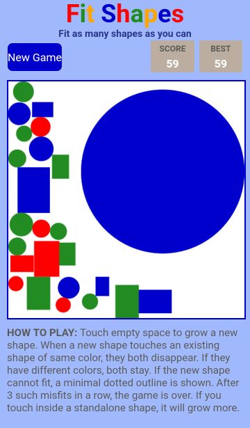
In “Fit Shapes” you try to fit as many randomly generated shapes into a box. Tetris-like, as seen in this Honda commercial. First twist: The shapes are getting bigger and bigger until they reach an obstacle (like another shape). Second twist: If two shapes of the same color hit each other, they disappear. Third twist: You never know what comes next, neither the shape nor the color (sounds great at first, but we’ll come to that later)
This idea is fresh and although there are a lot of Tetris or puzzle games out there, this specific remix is a rather unique and unseen. Another plus is the great performance of the game. It runs super smooth and fast, without any loading times, lags or breaks. Thirdly, it’s really easy. You intuitively know what to do and the controls are self-explanatory, especially after reading the how-to-play text.
Mute, Messy and Arbitrary
A text, that doesn’t have to be an integral part of the game screen, right? It needlessly reduces the size of the gameboard and gives the app an untidy and cluttered appearance. There is too much for the eye and too less for the ears. Apart from two or three very basic sounds, the app remains silent. It wouldn’t harm to breathe a more life into it, does it?
The only thing, however, that really bothers me is the somehow arbitrary gameplay. What’s the point of putting the shapes in order, if you don’t know what shape comes next? Even Tetris from 1989 (!) featured a preview giving you a hint where to place the current shape so that it’ll match the next one.
My suggestion: Remove the tutorial from the game board, put it into a start screen and use the regained space for a preview window so that the players can build on their strategy and not their luck.
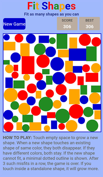
No room for more? Time to fill the dessert stomach!
- Fresh Idea
- Fast Performance
- Intuitive Controls
- More Sounds
- Improved Game Screen
- Preview Window
The Verdict
“Fit Shapes” presents a fresh approach to the Tetris theme. Give it a shot and download the game here!
All pictures are in-game screenshots.

